

android app google material design
Setup
Open a new Project in Android Studio. Click on Refactor and choose Migrate to AndroidX.
Now add Material Design library dependency in app level build.gradle file and sync the project. Make sure, you choose the latest version. You can track new releases on the GitHub repository.
implementation "com.google.android.material:material:1.1.0-alpha02" Also make your app theme child of Material Component as
          <style name="AppTheme"
            parent = "Theme.MaterialComponents.Light.DarkActionBar">
            <!-- Customize your theme here. -->                      .....
</style>
Material Text Fields
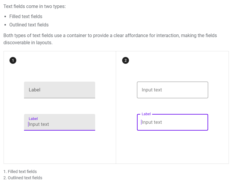
In order to use any of the above style of Text Fields, you have to make some changes in your style.xml
<style name="AppTextField" parent="Widget.MaterialComponents.TextInputLayout.OutlinedBox"><item name="boxBackgroundColor">@android:color/white</item>
</style>
By doing this all your TextFields will be Outlined text fields. And if you want FilledBox, you can use .FilledBox instead of .OutlineBox
just add this style in your theme as:
          <style name="AppTheme" parent="Theme.MaterialComponents.Light.DarkActionBar">
            <!-- Customize your theme here. -->
            <item name="colorPrimary">@color/colorPrimary</item>
            .....                      .....
            <item name="textInputStyle">@style/AppTextField</item>
</style>
Bottom App Bar
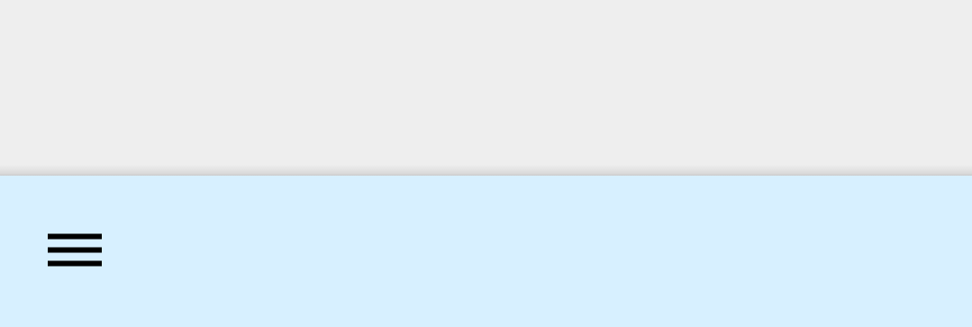
One of the best feature of Material Design is BottomAppBar. To implement BottomAppBar, you must use CoordinatorLayout as parent tag.
<com.google.android.material.bottomappbar.BottomAppBar
android:id="@+id/bar"
android:layout_width="match_parent"
android:layout_height="wrap_content"
style="@style/Widget.MaterialComponents.BottomAppBar"
android:layout_gravity="bottom"
app:backgroundTint="@color/skyBlue"
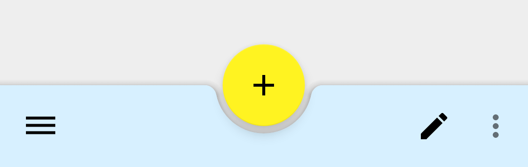
app:navigationIcon="@drawable/ic_dehaze_black_24dp"/> It will be looked like this
Wow! We can make it more attractive by adding a fab action button just by writing the following code directly in your CoordinateLayout tag.
          <com.google.android.material.floatingactionbutton.FloatingActionButton
            android:id="@+id/fab"
            android:layout_width="wrap_content"
            android:src="@drawable/ic_add_black_24dp"
            android:layout_height="wrap_content"
            app:backgroundTint="@color/colorAccent"
app:layout_anchor="@id/bar"/> 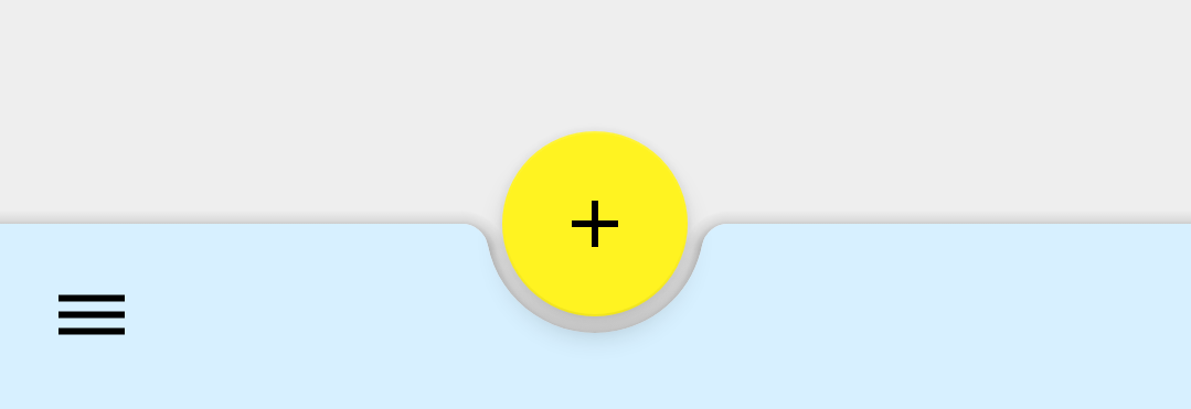
We can also change fab alignment and margin in BottomAppBar as follows
          app:fabAlignmentMode="end"
app:fabCradleMargin="20dp" 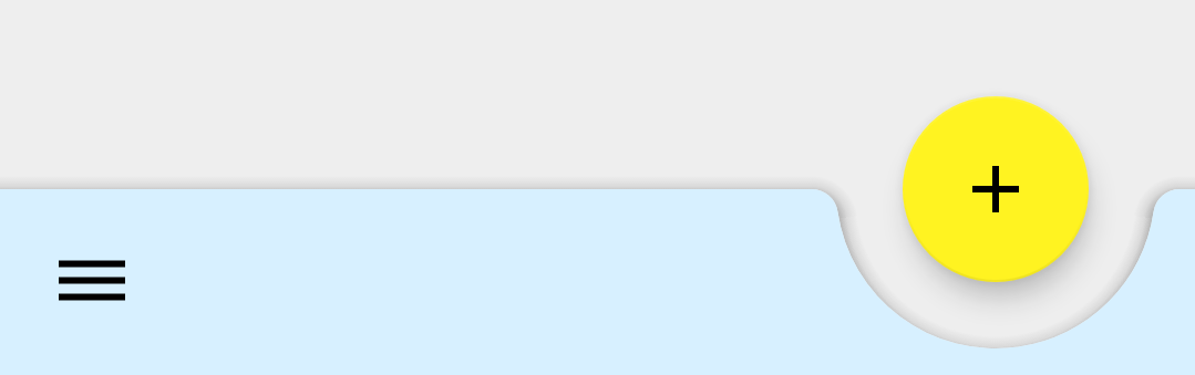
Final Code for BottomAppBar with fab Button
Adding Menu in BottomAppBar
Creating and attaching menu to BottomAppBar is very easy. Just override onCreateOptionMenu(menu) method normally as we override.
          @Override
public boolean onCreateOptionsMenu(Menu menu) {
            getMenuInflater().inflate(R.menu.home_menu,menu);
            return super.onCreateOptionsMenu(menu);
}
By default, this menu will not be displayed in BottomAppBar. You have to set Your BottomAppBar as supported action bar as follows:
          @Override
protected void onCreate(Bundle savedInstanceState) {
            super.onCreate(savedInstanceState);
            setContentView(R.layout.activity_main);              BottomAppBar bar = (BottomAppBar) findViewById(R.id.bar);
              setSupportActionBar(bar);
}
Handling Navigation Item and Menu Options Click
android app google material design
Source: https://medium.com/android-news/material-design-for-android-523996401fc1
Posted by: cobbentoo1954.blogspot.com
0 Response to "android app google material design"
Post a Comment